The 12 Best Front Door And Shutter Color Pairings To Boost Your Home's Curb Appeal
Whether you're just moving in or looking to update your lived-in home, painting your doors and shutters is one of the simplest and most effective ways of improving your curb appeal. It's an easy and relatively inexpensive way to freshen up the facade of your home, but it packs a big design punch when you choose the best color combinations for your design aesthetic. Various combinations of contrasting hues, neutrals, or pastels can draw the eye and make your home the focal point of the neighborhood.
From classic farmhouses to modern town homes, there are certain palettes of door and shutter colors that instantly give an aesthetic boost to your home. Some color combinations may seem obvious — like white-on-white or black with neutrals — but that may mean you're leaning into a classic color combo that will stand the test of time and trends. Other pairings are fresh takes on color and style that can bring a new design language to your neighborhood. Pops of red on otherwise stoic brick, for example, can update your home in an unexpected, yet fashionable way. Regardless of which vibe you're going for, there's a perfect combination that's right for you and speaks to your personal design preferences.
Black monochrome
Black is the sleek front door color that's always a great choice for curb appeal. In fact, a survey conducted by real estate giant Zillow revealed that homes with black doors experienced a sales boost of around $6,500 due to popularity. These houses were saved more on the site, creating a sense of desirability, which, in turn, translated to more competition for the home. Buyers were also more likely to come see a house with a black door in person than any other color surveyed. Leverage this with a sleek black door and shutter combo, adding timeless appeal.
Go for a classic white combo
A white door and shutter duo is probably the most classic look you can choose for your exterior. There's just something about the crisp starkness of this neutral hue that makes the front of a home look elegant and yet still inviting to those on the curb. One of the best accent colors to go with a red brick exterior, white-on-white provides the perfect blank canvas for the richness of the house materials to stand out. For a crisp white, try Benjamin Moore's Chantilly Lace or, for a warmer option, try White Dove.
Pair jewel tones with neutral anchors
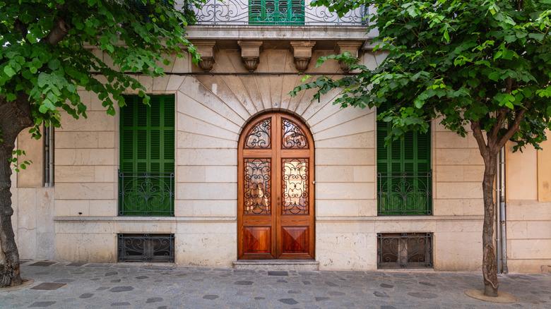
Jewel tones are the poppiest of colors and yet they somehow retain an old-world charm that's rich and timelessly elegant. Make the front of your home absolutely ooze with this decadent elegance by pairing a neutral door with some vibrant, jewel-toned shutters. Your exterior will look like it's been plucked straight out of the French or Italian countryside, immediately improving your curb appeal with a combo that looks richer than it likely cost to create. This is also a relatively unique combo that will make your house stand out in all the best ways in the neighborhood.
Embrace a cottagecore palette
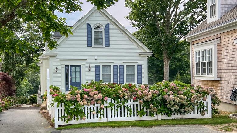
Cottagecore home design is having its moment in the spotlight with its fairytale appeal and idyllic aesthetics. If you want to lean into this overwhelmingly charming palette, then consider a monochromatic pairing of window shutters and doors in a color that suggests pastoral, without feeling overtly farmhouse. Colors like Behr's Washed Denim, a cornflower blue, Brookview, or a fresh sage green pop against white backgrounds to craft a vibrant yet soft facade; a trademark characteristic for cottagecore looks. Complete the overall look with some equally aesthetic flowers for the perfect storybook home.
Go bold with a pop of red
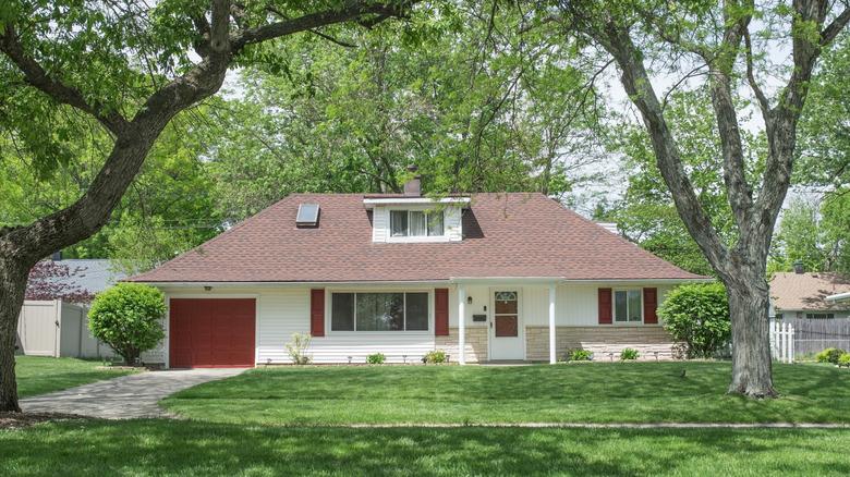
Give your home the pop of contrast it needs by choosing a bold touch of red for your shutters, doors, or even the garage. The subtle but effective tone against a white or neutral background draws the eye and can serve to highlight some of the best features of your home, or detract from an otherwise plain facade. It's a trendy, and perhaps drastic, yet fashionable update that doesn't take too much effort. Used well, this style can conjure up the idyllic feel of a small-town neighborhood, reminiscent of farmhouses or colonial homes.
Embrace coastal vibes with blue and gray
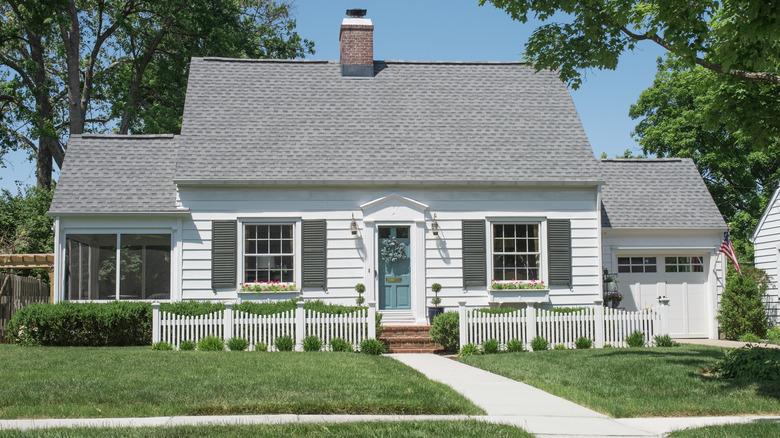
If you're looking to dress up a coastal bungalow, leave the obvious seashells and whale weather vanes off the home, and, instead, embrace a cool, breezy color palette that turns your house from cliche to charming. Pair aquatic greenish-blues (think Benjamin Moore's Surf Blue) with a matching, robust gray (like Millstone Gray also from Benjamin Moore), for a coastal look that's equal parts seaside retreat and delightful cottage getaway without overwhelming the house itself. It boosts curb appeal and creates a fun theme to dress up the rest of the house in.
Pastels and neutrals are a winning pair
If you're eager to add a pop of pastel to your home, do so carefully by pairing it alongside a universally appealing, neutral color. While pastels are a fun way to make your home stand out, the reality is that some cheery hues are actually colors you want to avoid for your front door, since they automatically deter folks who don't care for bold risks. But that doesn't mean to give up on colorful accents, rather grab a matching neutral color, like Sherwin-Williams' Relaxed Khaki, to fill out the home's other elements, like shutters.
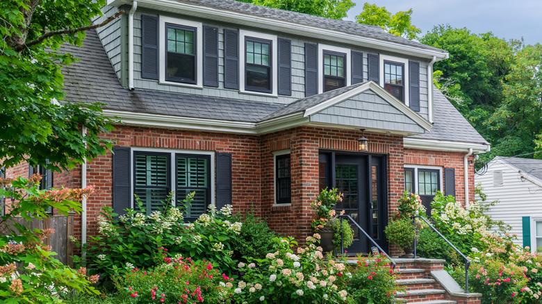
Black and red, a chameleon combo
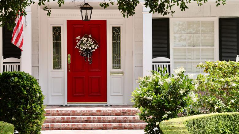
A red door and black window shutter combination is a surprisingly versatile combo that can read many different aesthetic ways. Depending on the architecture of the home, this pairing can feel very elegantly classic if gracing the front of a Federalist-style house, but can also feel incredibly cozy and country-chic if placed on a charming farmhouse. Whatever the vibe, the striking red door and timeless black shutters prove themselves to be universally appealing and flattering, instantly boosting your curb appeal for a great number of visitors, or even prospective buyers.
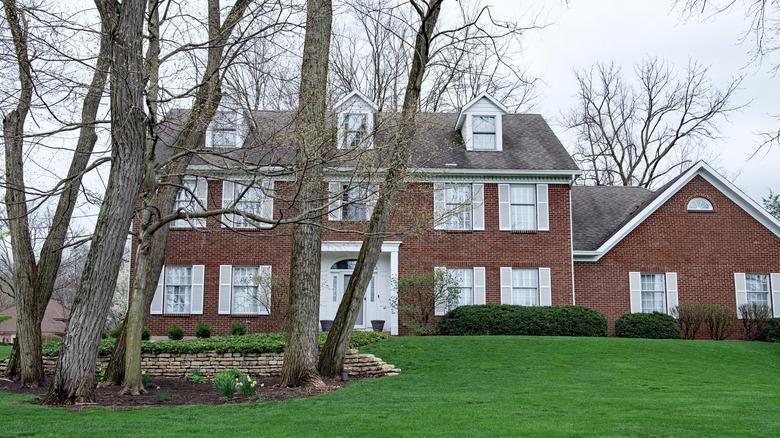
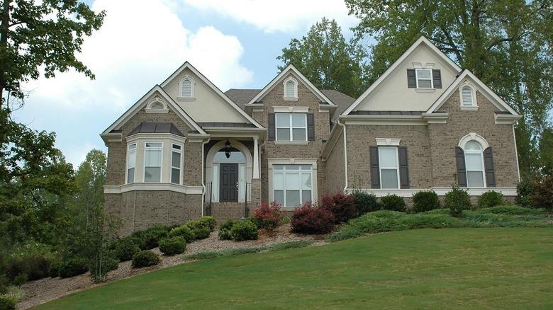
Black shutters and neutral doors are timeless and universal
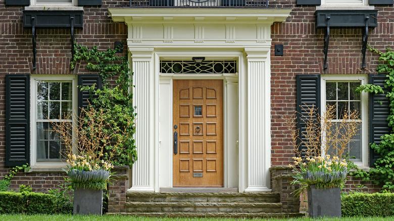
Across multiple architectural and design styles, black and neutral paired together have exuded elegance and suggest superior craftsmanship. Neutral colored doors, like wooden varnished ones, allow people to appreciate its construction, while black accents make a house pop. Well-used to create visual interest utilizing contrast, these dynamic choices will catch the attention of anyone passing by. Whether you have a historic or modern home, the combination of black and neutral tones is versatile and will remain timeless, grounding your home in a long tradition of design, without becoming crowded or outdated.
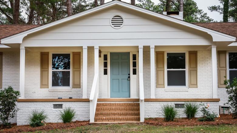
Mocha Mousse for everything
Mocha Mousse, Pantone's color of the year, is a sleek, on-trend color story that will make your house look very fashionable. The appeal of this color for your front door and shutters is both its uniqueness and the neutral quality that doesn't take over the exterior design of your home. Sherwin-Williams' Mocha exterior paint color is a great muted chocolate take on this trending color that will give your home an instant "curb-lift," while Behr's Mocha Foam is a softer, yet rich hue that will make your home pop on the curb.
Same color, different shade variations
If you want the facade of your home to stick to the same colors but want to add some visual dimension, pick a singular color that you love, then use two different shades for your door and your shutters. It adds contrast and depth without any accidental bad clashing when using two entirely different colors. Complimentary pairings, like Benjamin Moore's Norway Spruce, a rich sage, with Cushing Green, a deeper hue, for example, makes for a harmonious color combo that's unique while not taking too much of a risk.
Stately gray doors and shutters are a classic
Talk about classic combos: A rich, dark gray for your doors and shutters isn't just a way to boost curb appeal, it's a way to exponentially increase the stately elegance of your home. This monochromatic turn feels like both a classic and yet decidedly modern color scheme, unique to newer 20th-century architectural styles than houses of a bygone era. Various shades of gray, from Sherwin-Williams' blue-toned, Foggy Day to Benjamin Moore's charcoal-y Flint, feel luxurious and timeless, but still fresh for your facades.