Sherwin-Williams' 2026 Color Forecast Is Here & It's Stunning - Here's How To Use It
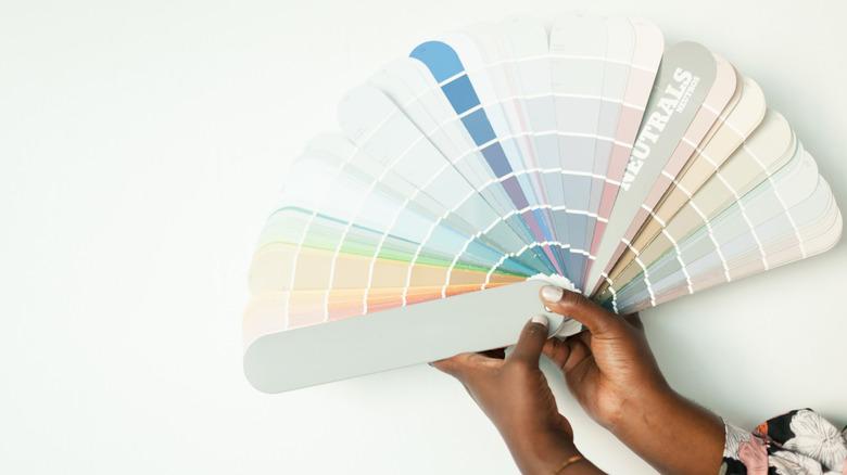
Sherwin-Williams recently introduced its Colormix Anthology Volume Two, which contains four meticulously curated paint color palettes forecasted to set the tone for 2026. With distinctly different aesthetics in mind, there is a vibe and mood for everyone in the annual Sherwin-Williams Colormix forecast, which can be used as a tool to help narrow down options in an endless sea of paint swatches. The Frosted Tints palette embraces cool, airy soft pastels aimed at creating a subtle and refreshing nod to color, while the Sunbaked Hues collection jumps unapologetically into the enveloping embrace of bolder warm shades that feel both nostalgic yet updated. The Restorative Darks palette creates timeless appeal by showcasing moody, deep, desaturated hues to create unforgettable yet tranquil wow-factor, while the Foundational Neutrals palette creates the same classic result with a mix of nuanced neutral shades with complex undertones for depth and sophistication.
Depending on which color palette and look appeals to you, the Colormix forecast is a fantastic guide to help inspire you to take a step past your comfort zone to try something new and exciting. However, it's worth noting it's important to choose what you love, not just what is trending for the sake of staying current, in order for your home's aesthetic to feel timeless to your personal taste – I can't tell you how many times I've seen as an interior designer that people tire of trending paint choices quickly because they don't speak to them personally. But if some of the shades in the Colormix Anthology make your heart sing, let's break down the overall vibe each palette brings and how to incorporate them into your home so you can enjoy them for a long time to come.
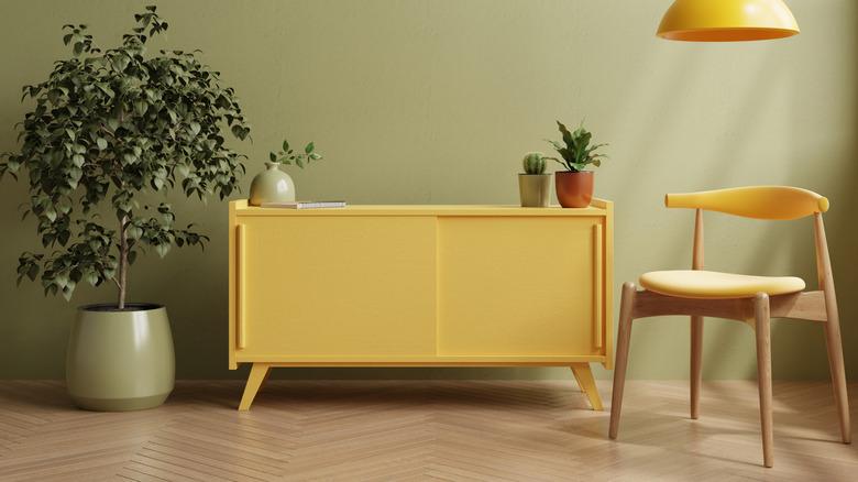
Sherwin-Williams palettes provide two distinct options for injecting color
On either end of the color spectrum, Sherwin-Williams included two forecast palettes that embrace opposing cool and warm hues for an elevated and nuanced step beyond neutrals. The first collection, Frosted Tints, is an assortment of airy, sophisticated pastels in a cool palette of icy blues, greens, and lavenders. Though they boast personality through color, the subtle desaturated color value leads to a serene, gentle, nearly-neutral effect, perfect for those dipping their toes into the world of color, instead of the intense saturated pastels fit for the Easter bunny. I love using these tranquil hues to color drench a space, including walls, trim, and ceiling, to give a light, airy effect with a refined, grounded feeling rooted in history and nature. The Frosted Tints are also dreamy on cabinetry for a more subtle commitment to fresh, soothing color.
Conversely, the Sherwin-Williams Sunbaked Hues color palette embraces the warmth and intensity of warmer red, orange, and yellow shades. From buttery yellows to rich desaturated terra cottas and brown-reds, this dramatic array of radiant colors takes the nostalgic tones of yesteryear and gives them new life with a hint of desaturation. These luxurious, luscious desert hues tiptoe the fine line between bold and refined with ease. This palette of hues is ideal for enveloping the walls of your entertaining spaces, like dining or living rooms, in a confident, dramatic burst of inviting color. Bedrooms with these warm sunset tones on the walls can also help create a cozy, restful environment for getting a good night's sleep. Additionally, some of the bolder hues would make for a very spectacular front door, boosting your curb appeal and welcoming first impression of your home.
Sherwin-Williams' collections create an impactful yet classic aesthetic
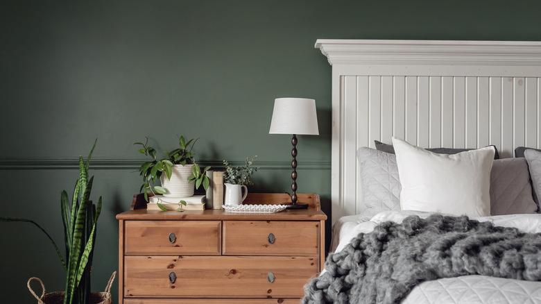
Sherwin-Williams' next Colormix palettes are both focused on creating timeless, refined elegance. The Restorative Darks collection is centered around deep, desaturated moody hues that create a bold yet tranquil vibe. While they have tons of rich impact with their dark essence, these classic earth tones are also deeply restful, comfortable, and healing through their grounded roots and desaturated color values. Not only is this my personal favorite palette among the bunch, but I think it's incredibly versatile for a wide variety of design styles, from traditional to modern. These dramatic yet subdued colors are perfect for creating a sophisticated, cozy, truly restorative bedroom sanctuary that doesn't skimp on style. The Restorative Darks palette also creates an intimate, soulful, and serene mood when used on walls in nearly all other rooms in the home. Plus, desaturated deep hues are beyond spectacular on cabinetry!
The final Sherwin-Williams palette shares similar dark shades as the previous one, but incorporates a gorgeous array of nuanced lighter tones to complete their timeless neutral palette called Foundational Neutrals. Ranging from near-black and deep browns to airy off-whites, this complex neutral collection is anything but boring. While all colors technically qualify as neutrals, the nuanced undertones, such as warm khaki, the softest green-gray, and deep ink blue, prove that even well-chosen subtle hues can have as much personality as overtly colorful palettes. These timeless shades will never go out of style and are endlessly adaptable to layer in nearly all spaces in the home, from walls and ceilings to millwork and cabinetry. Timeless in all design aesthetics, these intricately balanced colors bring a space to life with their subtle yet evolved complexity.